Tuesday 20 December 2016

drafting and planning: Article for double page spread

AGE OF REVOLUTION: BIGGER. BETTER. LOUDER.
“Bigger, better louder”. These are the ultimate aims of the new band ‘Age of Revolution’ who, despite their recent appearance in the punk rock scene, have high aspirations and are looking forward to the future with anticipation. The leader of the band, Grace Hill, agreed to sit down with Smash magazine during a hectic day to answer our questions and give us an insight into the past, present and future of the band.
Q: First of all, tell us about the history of the band first of all
A: At first it was just me playing guitar alone in my bedroom. Then, at the age of sixteen I decided to try my luck playing with a band. However, I didn’t have friends who played instruments. I posted on social media that I would like a band to play music with, and I could be the lead singer. Soon enough after I couple of days I met up with a couple of people who responded and we called ourselves ‘Grace Hill Band’.
Q: So how did the name ‘Age Of Revolution’ come along?
A: Age Of Revolution actually didn’t come along until recently. One reason to why we changed our name was because we though ‘Grace Hill Band’ sounded plain and boring. We needed something cool. We always had the dream of causing a musical revolution, so the word revolution had to be included with no doubt. And then I actually thought of ‘Age Of Revolution’ as a random thought and the band liked it!
Q: What are the band's plans for the future?
A:We mainly want to expand our audience. I'd like more people to listen to our music. I'd say our music is engaging and relatable so a lot of people can get to know it and like it.
Q: You recently released a new album, can you tell us more about it?
A: Yeah! Our new album is called 'Edge of tonight', and the title came about from a special song on the album, which i unfortunately cannot spoil for people who haven't listened to it yet. This is our new album amongst the several EP's we have out. Hopefully people like it and enjoy listening to the songs on it.
Q: Do you have any tour plans?
A: we are planning to tour the UK very soon. I think a tour would be a nice way of spreading the word about us and our new music. So, look out for tour dates very soon!
Q: Something about your personal life now, what is it like handling everyday life and the band?
A: Honestly, the band has become my personal life. It's part of my routine; it is essentially my life. At first it was difficult to coordinate everyday life and the band, as in the two would clash, but after this year or two years it has become normal for me to get up, eat breakfast and go to the studio.
Q: If you had to change anything about the band, what would it be?
A: Honestly, i wouldnt change anything. I love the way this band was formed, and the people it was formed with. I love our music and the impact we have on people. In some peoples lives we have already made a revolution. We get tweets from people thanking us for being a big part of their life. It's spectacular! I never thought this would come so far. So no, i wouldn't change a thing.
Q: Have you made any mistakes in terms of the band?
A: I dont think any of them were major. We [the band members] have petty arguments sometimes, so maybe having these pointless arguments is a mistake because they get in the way of the flow of things. We also live together so it's a bit awkward after arguing about who used the same tea bag or who left the window open at night.
Q: Is there any advice you would give to people starting out in a band?
A: Sure. There is one bit of advice that is key, which is to never give up and take every chance you get because you never know how taking this chance can turn your life around for the better.
Q: Last question, do you enjoy being in this band?

A: of course i do! The band is my life. I love to make music, tour and talk to fans. Fans are what keeps this band going to be honest, they give us the support and inspiration we need. I couldn't live without being in this band, and i definitely would have not survived without my bandmates.

Wednesday 14 December 2016

drafting and planning - location

as the costume of my cover star will be mostly black, i have decided that the background on which the picture will be taken needs to be white, as then it will be easier to cut out my cover star and put them on a different background. If the cover star is dressed in black, then taking the pictures infront of a dark background would be a disadvantage as when cropping the artist, the costume and dark background will mix together and it will be difficult to distinguish between the clothes and the background. The pictures also need to be taken in a well lit place, so that the pictures don't come out too dark. If the pictures came out too dark then this would have a bad influence on the appearance of the costume in which my cover star is dressed, and you wouldn't be able to see clearly what they are wearing.

Monday 12 December 2016

Drafting and planning - band names for the magazine

Main Band:

  • Age of Revolution

Cover line bands:

  • Teddy bear metal
  • Rocker Dad
  • Acid Blood
  • We say Summer
I have chosen to include these band names, which are not real, to build up the rock music ethos of the magazine. It is easier to use made up band names as then you are able to be sure to keep the rock theme as when using real artists, some of them may not match the rock theme of the magazine. 

Thursday 8 December 2016

Drafting and Planning - contents page plan

I have decided to plan out my contents page as then when I come to creating the cover page I will have an idea of the layout of features such as the list of contents and pictures. I do not have any original photography to work around yet, therefore it is important to plan things so that when I do have the photography I can use it in my work and see if it works well. I have decided to put two pictures onto my contents page in order to create cohesion throughout the cover page, contents page and the double page spread. I have taken the '+' sign from the smash magazine masthead in order to also create cohesion and to use it as a feature which will divide the things on the contents page from eachother.

Wednesday 7 December 2016

Drafting and Planning - costume

I have thought about different looks for my cover star, including the style for clothing. Judging from the style of clothing used by magazines such as Rock Sound, i think that my covernstar should be dressed in something dark, and something that grabs attention. I think that the use of the colour black is important as it is a key element of rock music, and i think that the use of black will make features such as cover lines stand out more. My cover star could wear ripped jeans, as they are seen as very rock-y and daring. Such as the make up, i want the clothing to also be dramatic to bring out the rock/punk style of the magazine.

Monday 5 December 2016

drafting and planning - cover star make up and props


This is the makeup that i decided my cover star to have done on the day that the pictures for the magazine will be taken. I have gone for a mid to dark brown smoky eye look which is quite dramatic and pops out against the light skin tone of my cover star. I think that a lot of cover stars on magazines such as Rock Sound have quite dramatic make up, but it is not as dramatic to the extent of being very dark. Therefore, this make up, while being dramatic, isn't too dark and therefore it won't take the readers attention off the features around the cover star such as cover lines. My cover star will also be dressed in black (therefore there will be contrast between the makeup and clothing) and will use my guitar in the photo on order to contribute to the rock theme of the magazine.
This is the guitar that my cover star will be using. It is an electric guitar, therefore it fits the style of the rock magazine and relates to the name of the magazine 'Smash', which connotes loudness. 

Saturday 3 December 2016

Drafting and Planning - fonts

In order for my magazine to be successful in creating the rock mise-en-scene, the masthead must relate to the rock theme of the magazine.
I have chosen these 4 fonts as i believe that they all would be appropriate for the rock music magazine:
I have then asked my friends and classmates to choose one font, which they think is the most appropriate. I counted up each vote using a tally chart next to each font. In total, 45 people voted for their favourite font. the font which received the most voted, 15 of them was font two. Then, both with 11 votes were fonts 1 and 4. The font which was least liked was font 3. I am happy with the results of the survey as font two is also my favourite. I like the little cross element used in the letter A, which can be a symbol used throughout the magazine to create cohesion. It is also the boldest font, which is appropriate for a font of a rock magazine. I think the boldness of the font goes well with the name 'Smash' as it has connotations of loudness and mess. I also thought that font one would go well as a masthead as i have used it before in a task where we had to create a magazine using pictures of existing artist. The font there went well with the colours and layout, however, i want my own magazine to be bolder and more rock themed than this one, therefore i think that this font wouldn't fit the magazine i am making now as well as font 2. Therefore, i have decided to use font 2 for the masthead as it fits in well with the ethos of the magazine.

Wednesday 30 November 2016

drafting and planning - photography

As my magazine is going to be a rock music, the cover star needs to reflect the theme of the magazine through their body language and facial expressions.
Image result for oli sykes
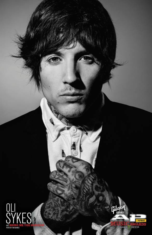
For example here, where Oli Sykes from Bring Me the Horizon can be seen to be very confident. He is looking straight into the camera, making direct eye contact with the reader, which adds a bit of intimidation. However, this also has a good effect of engaging the reader. I think that in rock magazines it is important for the cover star too appear to be quite intimidating as they are reflecting rock music, which is know to be in some ways harsh or brutal. Therefore, the front cover picture needs to be able to depict this. His straight facial expression suggests that he is focused, which may link to the headline, for example it could be 'Oli Sykes works hard on new album' and if he is pictured to be focused, it relate to the headline creating cohesion in the magazine.
Image result for billie joe armstrong photoshootBody language is also important. For example, here Billie Joe from Green Day is standing with his hands on his hips, which suggests that he feels comfortable and confident, which is good as being confident is very commonly seen amongst rock stars in music magazines. using confident body language shows the reader that the person is ready to talk about their music or whatever it is that they are going to be talking about, and it suggest to the reader that the information could be quite controversial due to the confidence of the person on the photo.

Tuesday 29 November 2016

Research into target market: Survey Monkey questionnaire analysis

i thought that this was an important question to ask as sometimes gender plays a big role in the style of a magazine. For example, girls are stereotypically expected to listen to lighter music, while boys are expected to listen to heavier music. This also applies to rock music and it's sub-genres. as 80% of my respondants are female, this means that over 3/4 of my target market will be females. This may suggest that my magazine should focus on the lighter types of rock music, as it is something that females listen to. However, i want to involve both genders equally, therefore my magazine will focus on all genres of rock in order to involve and appeal to everyone.
This question is also a necessity as for my magazine to be successful it needs to appeal to the ages of the target audience. From this i can tell that 90% of my audience are in the ages 15-18, therefore my magazine will need to target and engage this age group. This is an advantage for me as i am in this age group, therefore i have an idea of what people of my age like in music magazines and what type of rock music they listen to.
This question is important in order to find out what the price of my magazine should be. It is important for a magazine to be able to be afforded by their target audience, or else the magazine will not sell and make profit. 80% of my audience said that they would spend 2-4 quid on a music magazine, therefore this gives me an idea of what price range i am looking at including on the cover of the magazine.
I also think that it was important to ask how many respondants of the questionnaire listened to rock music. 90% of them did which shows me that the people who responded know what they are talking about and therefore the answers they give are relevant.
Colour scheme is an important part of a magazine, as it mirrors the style and theme of the magazine. I have found from this question that the colours red and black are very common, and most people associate these colours with rock music. Therefore, i could use the colours black and red in my magazine in order to successfully mirror the rock theme of the magazine.
I also asked my audience what kind of artists they would like to find on the cover of a magazine such as Rock Sound, a popular magazine. My audience have given some good responses that i think are appropriate, so i could use these artists in my magazine in order to get the mise en scene of a music magazine correct.
This question was important to me so that i know what kind of content my audience would like to see. This will come in handy when i create my double page spread and contents page so that i know what kind of features my target audience are looking for.

Sunday 27 November 2016

Drafting and planning - remake remodel task feedback

It is vital for me to have gotten feedback from this work as it is the final piece of work where i had to design a magazine before producing my own magazine.
From my feedback, i now know that a couple of things have to be added to make the magazine look more realistic.
Firstly, i have to add more features such as more supporting cover lines as well as basic conventions such as pugs. This will make the magazine look more realistic as magazines usually have more features, and mine only had three cover lines. However i did this so that the cover lines work with the layout, as there was no space for more cover lines unless i made them smaller, but then they would be less visible.
another thing that i have to work on is the colour scheme of my main headline as the black colour of the font blended in with the shirt of my cover star. therefore when producing my magazine i need to make sure that the cover star is dressed in an appropriate colour.

Wednesday 23 November 2016

Reasearch into similar product - colour schemes

Image result for rock sound
Colour schemes are important for magazines because it shows possible connotations of the content of the magazines. For example, the bright orange on this cover relates to 'new noise' as it suggests that the new music is exciting. This persuades the audience to buy the magazine, and makes the reader feel positive due to the bright colours. The mix of orange and pink gives a good balance of colours on the page, therefore making the page look organised and neat. it is important for a magazine to have a colour scheme where the colours work together so that the magazine looks realistic. I would like my magazine to include vibrant colours such as orange, pink, red or yellow as these colours are eye catching and so they can be recognisable on the shelves of shops. 

Drafting and Planning - possible names for the magazines

I want my magazine to have a name which will present the rock/punk nature of the magazine. 'Kerrang' is an onomatopoeia of the sound of the guitar, which is effective as it contributes to the rock theme of the magazine, and the stereotypical mess that is linked with rock music.
One of the ideas for a name for my magazine was 'SMASH' as, following Kerrang's footsteps, i wanted my magazine to depict the messines and chaos linked to rock music, and the onomatopoeia 'smash' would do this as it links to things such as smashing guitars.
I have also thought about 'Sound of Rock' as it describes the magazine well, and it shows the reader what kind of music is talked about in the magazine. However, i would have to stick strictly to the rock music, as with 'Smash' i could include punk and sub genres as it is not as specific.
I have also thought about.

Remake remodel task

I have created this magazine in order for preparation for when i make my own magazine. Using the masthead of Rock Sound allowed me to create a magazine cover in the style of a popular rock magazine, and i also want my own magazine to focus on the rock genre. My main cover star is looking down, which creates an image of being tough or intimidating, which is popular amongst rock magazines. I have used a colour scheme of black and yellow for my main headline, as yellow highlights the important words such as 'fantastic new album' which interest the reader and persuade them into buying the new magazines. Furthermore, yellow is a bright colour which effectively catches the attention of the reader, meaning that it can stand out on the shelf of a shop. I have also consitently used black and red for my cover lines. This was to create a consistency, and make the page looked neat, and not have many different colours on the page. This is due to the fact that many different colours on a page may make the front cover look messy and disorganised, and in result less realistic. I have included a puff, which is a ticket giveaway. These puffs are usually seen on magazines as they are effective ways of persuading the reader into buying the magazine, as well as give the reader something they can't get somewhere else. i have also added a selling line, which tells the reader the motto of the magazine, making the magazine relatable to the reader. I have also included the web address of the magazine so that the reader knows that an online version is available and to inform them that this is where they can find out more about the magazine. I have also added the essential bar code in order for the magazine to be able to sell in retail. Also, the issue date so that the reader knows the date of publishing.

Wednesday 16 November 2016

target market research: Target Audience of Rock Sound Magazine

The audience of rock sound magazine appears to be 15-24 year olds. 77% of this age group are female. Overall, from outside the age group 55%, over a half, are female. Rock sound also helps around 80% of their audience discover new music and new artists, which is important for a magazine so that they can meet the needs and demands of all of their target audience. Rock Sound magazine is published every 4 weeks, meaning that there are 13 issues per year. The 4 week age gap allows the creators of Rock Sound focus on creating the next issue and include every detail needed. This also allows the young audience to save money, as well as creating a sense of anticipation for the next issue.
I have decided to take inspiration from rock sound for the reasons listed above. I think that my magazine will be successful if i take example from a popular Rock Magazine who's target audience is 15-24 year olds. I also fit in the age group, so i cant relate to the magazine and produce a magazine that people of my age will be able to engage with.

Tuesday 15 November 2016

Research into similar product - double page spread

Image result for rock sound double page spread
this double page spread is from Rock Sound magazine. I think that this double page spread is effective for a few reasons. Firstly, the colours such as black and white on a grey background nicely contrast each other, making the text visible. The title of the magazine is also effective as it uses different font sizes. 'Absolutely' will catch the reader's attention, it will make the reader want to read the article. Furthermore, the use of pink throughout the title highlights important elements, which make the reader have more interest in the article. The layout is effective as the text and image are on separate sides which means that the page looks more organised. The title spreads out onto the left side of the page, showing the link between the artist and the article which is important, as the reader will know who the article is about. The body language of the star suggests that he is confident, which shows that the article may be controversial, or about the personal life of the artist. The subheadings within the text are on a white background which separates them from the rest of the text, and introduces new topics or questions.

Monday 14 November 2016

Research into similar product - typography

My magazine will be inspired off magazines such as Rock Sound and Kerrang.
In the most of the articles of these magazines the fonts are very bold and noticeable on the page. This is effective as a bold font can help contribute to the loud, and in some cases, controversial message of the magazine. The typography can also help the reader identify the main headline between other cover stories, which adds a planned out and neat look to the page. The typography can also help to add to themes. For example, if an issue has a robotic theme, then typography such as font will look rather robotic and mechanical; it helps to keep up a consistency throughout the magazine.
Typography is also important in making the magazine look realistic. Choosing a font and it's colour can be critical to the look of the magazine, if a generic or inappropriate font is used then the magazine will seem unrealistic and wont sell very well due to the audience not finding it attractive to the eye. Here are two examples of front covers from each magazine which i think are effective:
Image result for rock sound
On this magazine i like the fact that the typography is used to contribute to the main image, as the word 'pop punk' looks like a part of the water spilling out of the can, and the other words around stand out, contributing to the pink and blue colour scheme of the magazine.
Image result for kerrang
Similarly, i like the typography looks here as it adds consistency to the front cover of the magazine. The magazine looks realistic and more organised. 'Green Day' catches your eye and makes you notice the whole headline.

Tuesday 8 November 2016

Research into similar product - contents pages

I have decided to look at a Kerrang Magazine contentents page, as my own magazine will take example from Kerrang Magazine as it is a famous Rock magazine with a target audience of younger people.
Image result for kerrang contents page
I really like this contents page for several reasons. First of all, i like the use of a few of secondary images on the page. These help the reader visualise things, and help them see what the article is about without having to go to the page. I like the use of the picture of a double page spread also as it shows the reader what they can expect, and it encourages the reader to move on. I also like the main, bigger picture of the main article about Bring Me The Horizon as it creates cohesion and gives the reader an insight into what they can find in the magazine. Furthermore, the use of the Kerrang logo on the contents page also creates cohesion, and reminds the reader what magazine they are reading. I like that the words 'contents' and 'this week' are in the same colour as they link and point out what can be find in the particular issue of the magazine. I would also like my magazine to have similar features as it would look like a realistic and professional magazine.

Monday 7 November 2016

Research into similar product - Mastheads

I have decided to look into mastheads in different rock magazines in order to establish what they have in common. This will help me see what a rock magazine's masthead would usually look like, and i can apply these things to my own rock magazine later on.
Image result for rock sound
Most Rock Sound magazine mastheads are at the top of the page near the skyline. This allows, both, the skyline and masthead to be pointed out by eachother. For example, the reader will notice the masthead and then the skyline above it or vice versa. This is important as the reader will notice the magazine name and then key features in the magazine. As you can see, the cover stars are in front of the main image, making direct eye contact with the reader. This acts in two ways. It's brings the reader's attention towards the masthead as well as makes the reader feel engaged in the magazine. I think this is important as the reader needs to be able to feel engaged and relate to the magazine.
Image result for rock magazines
A similar thing happens on the cover of Classic Rock magazine. This tells me that these techniques are common, and are very popular amongst rock magazines. It is a good idea that i do something similar as, first of all, it will show my layout skills but it will also apply to the rock theme of the magazine.

Sunday 6 November 2016

target audience research (kerrang)

I have chosen my magazine to orientate around the rock/punk/pop-punk genres. I picked these genres because it is the type of music that i usually listen to, and because i can find multiple magazines to gain inspiration from.
Image result for Kerrang
Kerrang magazine has the same audience that i want my magazine to have. The audience of Kerrang magazine are young people of ages 15-24. Most of this target audience are therefore teenagers. Kerrang relate to their target audience in a couple of ways. For example, Kerrang features musicians who their target audience is likely to listen to. For example, on this cover it is Gerard Way of My Chemical Romance; a majority of Kerrang's target audience are aware of who he is. This way, Kerrang attracts and maintains their target audience.
My magazine will also have a similar target audience of teenagers and young adults. I think this is a good idea for i am a teenager and i know what people my age, who listen to rock music, are interested in. 

Friday 4 November 2016

Practise magazine in Page Plus

On the front cover, I have decided to use a range of codes and conventions in order for the magazine to look realistic and well organised. First of all, I have used a blue and yellow colour scheme throughout the magazine. This is because Halsey has blue hair with a yellow fragment on her pictures. This creates cohesion between the artist and the magazine. I have also chosen to do this because blue and yellow go together nicely. I have used more yellow in the text than blue because the yellow fragment in her hair is smaller, therefore there would be more blue on the page if I used mostly blue instead of yellow. This way, there is a nice balance of the two colours on the page.
Furthermore, I have decided that the name of the magazine will be ‘Smash!’ this is because it relates to the rock theme of the magazine, and is an onomatopoeia which can make the reader imagine smashing something, which contributes to the rock theme as rock connotes mess and loudness. I have chosen the colour of the masthead to be blue as it relates to the general colour scheme of the magazine. I have also included a selling line which is the motto of the magazine and makes the reader feel more engaged                                                                  
I have of course included the bar code and the price to make the magazine able to sell in retail. This is important as then the publisher of the magazine can make profit off of the magazine.
I have also included a couple of cover lines apart from the main headline in order to make the magazine seem more realistic. This also shows my layout skills as it proves that I can fit multiple things on the page.
Furthermore, I have chosen the main image for a number of reasons. Firstly, the way halsey looks in the magazine shows that she is emotional, and so it shows her sensitivity which relates to the songs on her album, which she then talks about in the magazine. Plus, I felt that the colour scheme would work nice on the magazine, and the way she is standing on the picture makes it easy to place cover lines and secondary image, as well as the main Headline.
I made the main headline very bold on the page so that it stands out and grabs the attention of the reader. The main headline also contributes to the colour scheme of the magazine.

On the contents page I decided to include the masthead, which creates cohesion between the cover and contents page. I have places ‘CONTENTS’ at the top of the page in a bright colour. This is because it will catch the reader’s attention, stand out on the page and make it obvious that it is a contents page. I have also made the word ‘contents’ and subheadings to be in the same font as the masthead, which adds to the cohesion and consistency throughout the magazine. I have also added secondary images to make the page look more interesting as well as linking them to the cover lines. I have also included page number to make the magazine seem more realistic. The background of the contents page is blue, with yellow subheadings in order to contribute to the blue and yellow colour scheme that is visible throughout the magazine.
I have decided to include the masthead on this double page spread in order to create cohesion throughout the magazine. I have also made the title of the artist be in the font of the masthead to contribute to the cohesion made throughout the magazine. I have also included the colour scheme of blue and yellow as it reminds the reader of her hair and creates symbiosis between the artist and the text. I have also included text which wraps around the artist's body on the page which makes the page look more organised. The use of Drop Caps in the text symbolize new paragraphs, just like in a real magazine.

Thursday 3 November 2016

Self assessment of layout experiment task

I believe that what i could of done better when designing the magazines is use a range of different colour schemes. In four of my magazines the colour scheme is mainly red and white. Although i didn't do this on purpose, i should of looked back on the similarities sooner and realised the repeating pattern of red and white colour schemes. I needed to use a range of colour schemes in order to see which one looks best. Therefore, in the future i need to make sure that i am experimenting with a range of different colour schemes to see which one will be most useful later on for my own magazine.
Furthermore, I think that i could of also added more cover lines to each magazine in order to make the magazines look more realistic, as a normal magazine would usually have a few cover lines, and each of mine only had three.
In addition, i could also improve on my analysis as although i did analyse a couple of things i did, but i can go into depth and explain the effects this will have to the reader and the end effect of the front cover of the magazine. I could also expand by writing about the features that i might have missed out on.
I plan to use this exercise in the future as it shows me what works best with particular types of magazines, and which fonts apply and which ones do not. Layout is also important, and this task helped me practice the placing of features such as cover lines on the page. This will be useful in the future when creating my own magazine as i have the skills needed for designing the layout of the cover page, so that the magazine looks professional and realistic. Furthermore, i had to apply generic codes and conventions to the magazines during this task, so it gave me practise on creating things such as anchorage text, which is essential to grabbing the reader's attention.
I also want my magazine to be a rock magazine, and this task enabled me to create a cover page of two typically rock magazines. This will help me in planning my own magazine as i will know the skills needed to create a good rock magazine of my own. I also practised making the magazine to the liking of the target audience, which is important so that the magazine appeals to the target audience and in result sells successfully.

Tuesday 1 November 2016

Layout experiments task

One of the most successful things that i have managed to achieve when designing this magazine cover was the cohesion between the masthead and drake by the colours of the text. Most of my text is gold to match the colour of Drake's shirt and his accessories. I have also made a reference to one of his most famous songs, therefore, it is relatable to fans and adds humour to the magazine. Furthermore, i have included some red highlights to match the text to the masthead. Furthermore, having less colours on the page can mean that the page looks more organised. I have also included ancorage text to hook the reader, and puffs such as exclusive interviews to persuade the reader to buy the magazine. I have also included the essentials such as the date of issue publishing, website and price to accompany the barcode.

 With this magazine, i had to build up and image of a band. I have chose this to be a hippy band because of how the band look and the tie-dye colour of the woman's dress, which is stereotypically hippie. I have chose the name 'Hippie Hype' as it relates to the genre of the band and the word 'Hype' suggests that their music is fun and interesting. In the subtitle and anchorage text i said that the band is new, which can persuade the reader to buy the magazine and find out more about the band. I have chosen to put red boxes behind the main cover line and the subtitle to make it cohesive to the masthead. I have chosen the text colour to be yellow and red as they go together, and match the masthead. I have chosen the font of the main headline and the font of the band be in a hippie style to contribute to the genre of the band. Furthermore, i have included a cd review which may attract the audience. I have also included the price, date and website to make the magazine able to sell.
 In this magazine cover i decided that the main colour should be red to match the hints of red in the masthead and in the picture of the artist. I also think that the red colour stands out boldly  against the black background. I have also included anchorage text which can hook the reader and persuade them to buy the magazine. The additional cover lines will tell the audience what is in the magazine without them having to look at the contents page. I have also included the date of when the magazine was published, website and price so that the magazine can be sold in retail. A couple of white elements on the page also link to to the masthead, which makes the page look more organised and creates cohesion.
For this magazine i have also used the colour red as the main colour. This is mostly because of the masthead and to create a sense of cohesion between it and the text so that the page looks well organised. I made the main cover have two layers to it so that 'Marilyn Manson' is the main thing that stands out on the page apart from the masthead. Furthermore, the subtitle to the main title is in white to link to the main image and also make it more visible and differ from the rest of the text.
For this magazine, i have used the colour white as the main colour of fonts in order to make the page look organised. The white text also links to the white background and makes the main image stand out more. I have of course included the date, price and website along with the barcode in order to make the magazine able to sell. Above the masthead i have also included a selling line, which is a motto of the magazine which briefly describes the content of the magazine and make people want to buy it. I have also included a pug, which is the giveaway which will persuade the audience to buy the magazine as they get something free with it. Furthermore i have also included other cover lines to make the reader aware of what else they can find in the magazine.

Wednesday 19 October 2016

Research into similar product

Image result for Q MAGAZINEImage result for ROCK SOUND
I have chose to look at these two magazine because of their mastheads. It appears to be the boldest and brightest . The masthead on the Q magazine fits in the colour scheme on the page, which makes it look organised and neat. The 'Q' stands out against everything else, catching the attention of the reader. It is also placed in the left third, which is important as the magazine needs to be seen from the shelf. However, the rock sound masthead is placed in the middle of the page under the skyline, which makes both the masthead and skyline visible. It isn't covered by the cover stars, therefore it is easy to spot on the page. For my magazine i have to consider the style and placement of the masthead in order for it to look like a professional magazine. I think that Q and Rock Sound magazines are good examples as their mastheads are bold and visible.

Tuesday 18 October 2016

Research into similar product

Image result for rock sound contents page
I have chosen to analyse this contents page because it looks like the type of contents page that i'd like my magazine to contain. I like how the image is spread onto the whole page. It makes it seem important and i can link the image on the contents page to the main headline on the cover page. This will show that the cover artist is important and the focus of the issue of the magazine. I like how the list of contents has the same background as the image, as it fades into the background and looks neat. The contents are all on the right side of the page; therefore they are easy to find Furthermore, the quote from the cover artist can hook the reader and persuade them to buy the magazine in order to read the article. I like the black, red and white colour scheme on the as it contributes to the rock/punk theme of the magazine. I can use this as inspiration for my contents page as Rock Sound magazine is a good example of a rock magazine. 


Monday 17 October 2016

Research into similar product

Image result for rock sound front coverImage result for rock sound front cover
I have chosen these two front cover for one main reason, which is body language and facial expressions. A magazine like Rock Sound focuses and rock and punk genres, as well as their sub-genres which is the type of music i want my magazine to focus on. It is clear that both of these cover artists contribute to the type of the magazine by their body language. For example, Green day on the right are standing looking very sure of themselves and give the vibe of being tough. This is important as the music that Green Day play is labelled as rock/punk, so their body language expresses the kind of music they play. Furthermore, Oliver Sykes from Bring Me The Horizon on the left has a very tough facial expression, and he is making eye contact with the reader which can make the reader feel almost intimidated and feel that he is very important. On the front cover of my magazine, i want the cover star (whether it is me or a friend) to imitate the music genres that my magazine focuses on. I can use these two magazine covers as guidance as they tell me that looking tough and confident is very likely in cover stars of rock magazines.

Sunday 16 October 2016

Research into similar product

Image result for kerrang magazine
I have picked this front cover of Kerrang magazine for a number of reasons. First of all, my magazine will have a pop-punk/rock genre, and i feel that Kerrang magazine reflects these music genres the best, therefore, i can use it as a guide for my magazine. Secondly, this issue has a similar colour scheme to what i'd like my magazine to have. I like the mix of colours such as red, white, black and yellow as the compliment each other. A red cover line is very likely to stand out, like on this magazine front cover where the main cover line stands out nicely because it is in bold, red letters. Secondly, yellow text or black text on a yellow background catches the attention of the reader as yellow is a bright colour. Things such a puffs, pugs and screamers could be done in yellow as they need to catch attention. This way, the reader will recognise the important features. Also, i feel that a white background is important so that the main image can be clearly seen. In this Kerrang magazine cover page, the 3 cover stars are dressed in black, and are layered onto a white background which is effective as they don't blend in with any other colours. This is important as the cover stars have to be seen clearly.

Thursday 6 October 2016

Preliminary task


Drafting and Planning: investigating typography

In this task I had to identify the font that is the most effective for the theme of the magazine. I have decided to look at each one of these magazine covers and see why the font works, or why it doesn't. The purpose of this task was to investigate fonts in order to notice the importance they have. If a font does not match the theme, then the magazine looks unprofessional. For example. the font on front cover D does not match the theme of the magazine at all. It looks too professional and fancy, while the theme of the magazine is machine-like and robotic. The font is also not very clear to read, and does not catch the attention of the reader. On the other hand, the font on front cover E works best as it adds to the robotic theme of the magazine because the font is bold, clear and looks machine-like. This shows how important fonts are because they help to establish the theme of the magazine. Magazine cover F could also work, however it is not bold enough and looks too plain compared to font E; it does not catch attention as much as E. Furthermore, font A is the opposite of the theme. It is generic and plain, it is too simple which makes it very inappropriate. This task will help me in the future as it shows the importance of fonts, as well as it helps me see how to match a font to the theme of the magazine. I can come back and use this task when creating my final magazine.

Tuesday 4 October 2016

Research into similar product - double spread 3

Image result for all time low double page spread
I picked this double page spread because the colours stood out to me. The bold 'Arena Land' in the title of the article caught my attention as it is written in a bright yellow colour. The title also stands out against the darker background of the picture. What also stood out to me was 'the big story' written in a bright yellow box. This links to the title and shows that this is the main story. I also like the headline 'somewhere in arena land' and is it a play on words of one of their songs 'somewhere in neverland'. I like the picture and its position on the page as it takes up most of the page, showing that the article is about the band in which he is in. He is also stood with his arms out, which could show that he is embracing the 'arena land' stated in the title. The white font stands out against the darker background, making it clear to read. Some parts of the text are bolded, this shows the important parts of the article. For example, in the subheading underneath the article, 'Alex Gaskarth' and 'All Time Low' are bolded, which shows that they are important and relevant to the article.

Monday 3 October 2016

Research into similar product - double page 2

Image result for double page spread music magazine
I like how Nicki Minaj is positioned on the page. She is positioned sligthly to the left, which gives more space on the right for the article. She is pictured to be leaning over her name in the title, which shows that this article is about her. She is also looking directly at the reader, making eye contact and bringing attention to her. The font of 'The gospel according to' makes the article look fancy, and the 'Nicki Minaj' in bold pink writing not only catches attention but also matches the baby pink background. The black font of the main article stands out which makes it easy to read.  Some quotes from her have the same background as the 'Nicki Minaj' in the title, which show the reader that the quote links to her. The title of the article links effectively to the article as it appears to be written like a bible verse with the numbering of different sections of the article. The text is placed around Nicki, effectively filling the page. The colours (pink, black and white) compliment each other as they make each other stand out.


Sunday 2 October 2016

Research into similar product - double page 1

Image result for double page spread rock sound
I like the layout of this page as it looks well organised. The picture of the band on the right side links to the article on the left side. The band is looking directly into the camera, making eye contact with the reader. This makes the reader feel more engaged in the article. The headline next to the image of the band stands out and gives the band their credit. Some text in the article is bigger than the other, therefore it shows key quotes from the band. The headline also links to the article content on the left side of the page. There are three different fonts which are used for three different types of text. There is a font for the band's name, then one for the headline and key quotes and another one for the main article. The white colour of the article text compliments the black background, making it easy for the reader to be able to read. The article starts with a bold drop cap, making the article stand out on the page and catching the attention of the reader.