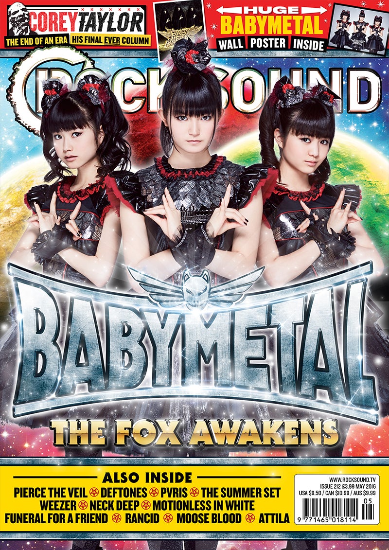
Most Rock Sound magazine mastheads are at the top of the page near the skyline. This allows, both, the skyline and masthead to be pointed out by eachother. For example, the reader will notice the masthead and then the skyline above it or vice versa. This is important as the reader will notice the magazine name and then key features in the magazine. As you can see, the cover stars are in front of the main image, making direct eye contact with the reader. This acts in two ways. It's brings the reader's attention towards the masthead as well as makes the reader feel engaged in the magazine. I think this is important as the reader needs to be able to feel engaged and relate to the magazine.

A similar thing happens on the cover of Classic Rock magazine. This tells me that these techniques are common, and are very popular amongst rock magazines. It is a good idea that i do something similar as, first of all, it will show my layout skills but it will also apply to the rock theme of the magazine.
No comments:
Post a Comment