This is the picture i have chosen for my front cover. I have chosen this photo as i think it will fit the front cover well. By this i mean there is enough space for the masthead and other essential codes and conventions such as headlines, and the way that the cover star is standing gives good space for the placement of these features. The facial expression is quite serious, so it contributes to the rock theme of the magazine.
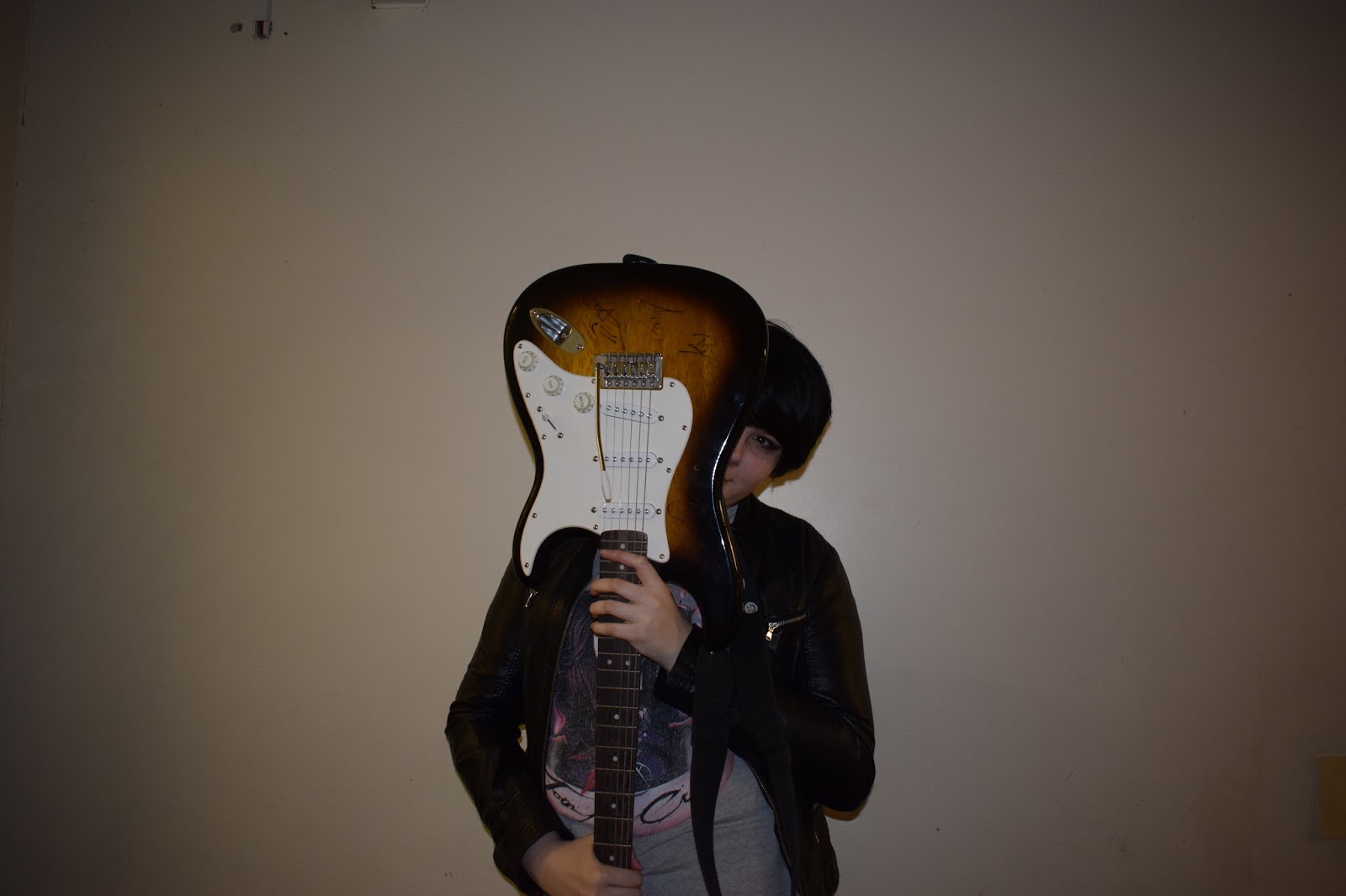
This is the photo i have chosen for my double page spread, i chosen this as i like the way the cover star is in the middle, therefore the text can be fitted around the cover star. The way the cover star is hiding behind the guitar adds a sense of mischief and cheekiness, which adds a sense of humour to the article.

No comments:
Post a Comment